Alimentation Biodev
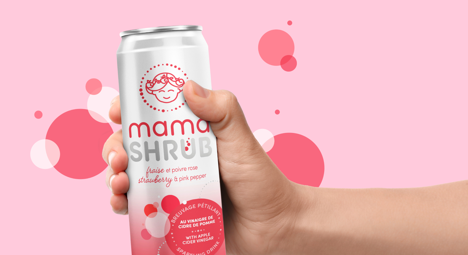
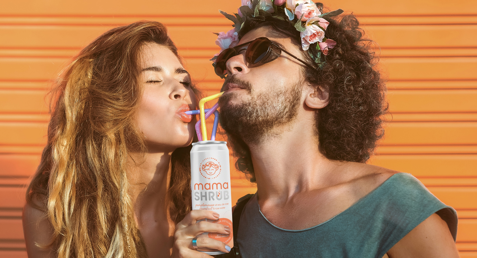
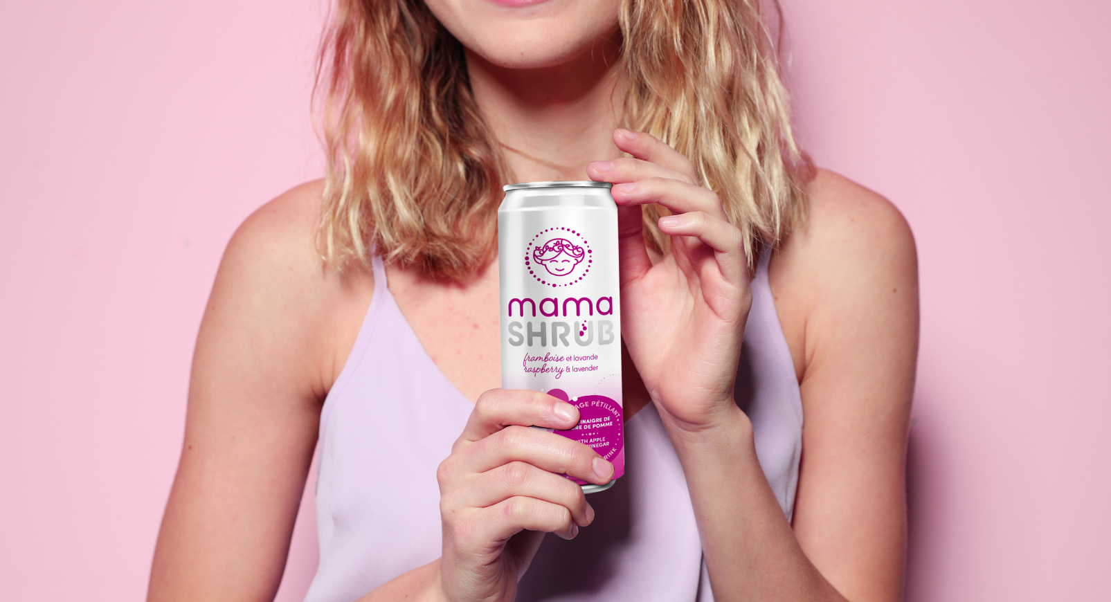
Mamashrub
Mandate
In the ready-to-drink department, competition is strong. Brands must compete creatively to design original packaging that will make their products stand out. The creative team had to design a striking visual identity that would allow consumers to easily understand this unique and innovative product: a ready-to-drink shrub.

Challenge


Objectives
The concept puts the Mama forward in a fresh, natural and energizing way. The ombré colour, moving from light to dark, immediately refers to the flavour of the drink, while the round, playful typeface embodies the colourful, invigorating nature of the brand.